Chattels File Management System for Vendors
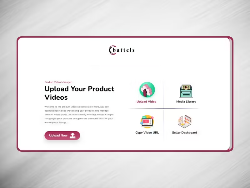
Developed a secure file management system on a subdomain of Chattels for vendors to upload product videos.
- Client Kunle Ojebode
- Date April, 2024
- Service WordPress Website
- Budget $0
Developed a secure file management system on a subdomain of Chattels for vendors to upload product videos.

As an extension of the Chattels multi-vendor platform, I was tasked with building a public-private file management system specifically for vendors. The objective was to create a secure environment where vendors could upload and manage their product videos without exposing them to others, while also providing easy access to these files for product listing purposes.
I created a fully functional file management system on a subdomain of Chattels, allowing vendors to safely upload their product videos via the frontend. The system is designed to restrict access so that vendors can only view and manage their own videos. I also implemented a feature that allows vendors to easily copy the video link, which they can then use when creating product listings. This setup ensures the smooth integration of video content without the need for third-party services.
Additionally, I incorporated strong privacy measures, ensuring that each vendor’s content remains private and secure, meeting the high expectations of both the Chattels platform and its vendors.


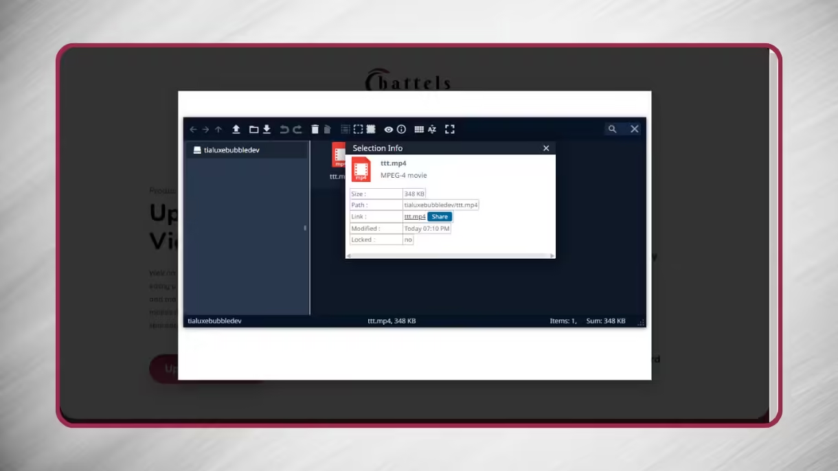

This project enhanced the functionality of the Chattels platform by extending its capabilities with a secure and efficient video management system. It allowed vendors to focus on presenting their products more effectively, while ensuring privacy and ease of use.
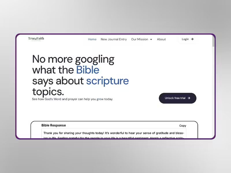
Built a dynamic, AI-driven Bible journaling platform with personalized user experiences and premium content.

True Faith Journal (TFJ) is a faith-based website designed to offer users fast access to Bible scriptures and journals through AI technology. Calvin, the owner, was referred to me by Hudson, the owner of Elite Team AI, to create a platform that would cater to users of different spiritual needs. The main goal was to create a dynamic and engaging experience for users seeking to deepen their faith.
I developed a feature-rich website using conditional logic to deliver unique experiences to three distinct user roles. From personalized menus to tailored homepage experiences, each user set is served dynamically. Premium users enjoy exclusive access to advanced features such as custom frontend posting, allowing them to log their Bible study entries. To ensure a smooth user experience, I implemented Google SSO, which simplifies the sign-up process.
The website is gated to restrict premium features to only paying users, ensuring an organized structure and improved monetization strategy for the platform.


Building True Faith Journal was a rewarding experience, as it combined both advanced technical solutions and meaningful content delivery. The integration of AI and dynamic user experiences established TFJ as a unique platform for Bible study and faith journaling.
Implemented premium access and Google Single Sign-On for Elite Team AI’s AI services platform.

Elite Team AI, owned by Hudson, offers a variety of AI models as services through its platform. Hudson approached me via Fiverr to restrict part of the website to premium users and improve the user registration experience. The goal was to provide exclusive access to premium content while ensuring a smooth sign-up process.
I designed a secure, gated section of the website, allowing only premium users to access select AI models and services. To enhance user experience, I created a fresh, intuitive sign-up form that streamlined the registration process. Additionally, I integrated Google Single Sign-On (SSO) to simplify login for users, enabling them to sign up and access the gated content with their Google accounts effortlessly.
By implementing these features, I ensured that only authorized users could access premium content while making it easy for new members to join with minimal friction.


The improvements to Elite Team AI’s platform, including gated access and Google SSO, helped enhance user experience and protect valuable premium content. These additions made the platform more efficient for Hudson’s business and positioned it as a reliable AI services provider.
Developed a complex multi-vendor website for furniture and appliances with custom advanced features.

Chattels is a multi-vendor platform designed for the sale of furniture and household appliances. The goal was to create a feature-rich website that would enable multiple vendors to showcase their products efficiently. I was responsible for building this robust platform, incorporating advanced features for both vendors and customers to ensure a seamless user experience.
To achieve this, I designed and implemented a dynamic multi-vendor system on WordPress. This included a robust mega menu to help users navigate the vast selection of products easily. I also integrated custom features tailored specifically for vendors, such as intuitive dashboards and product management tools. Due to the complexity of the platform, I utilized custom code to push beyond the limitations of WordPress and the plugins used, adding enhanced functionalities such as advanced search filters, inventory management, and automated vendor payout systems.
Additionally, I optimized the website’s performance to handle heavy traffic and large amounts of data, ensuring that both vendors and customers enjoy a smooth, reliable experience.
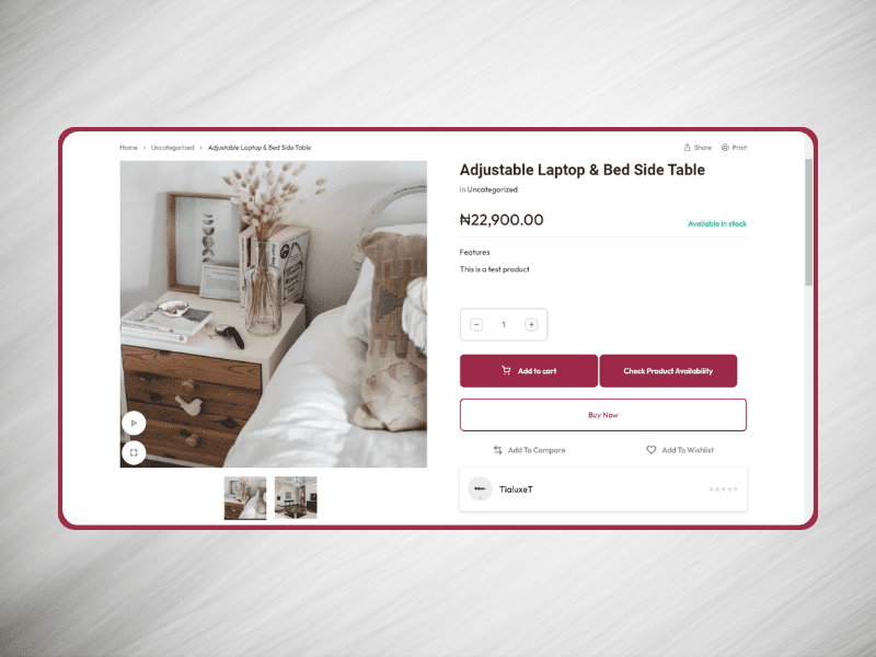
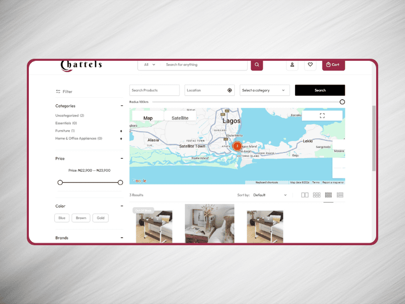

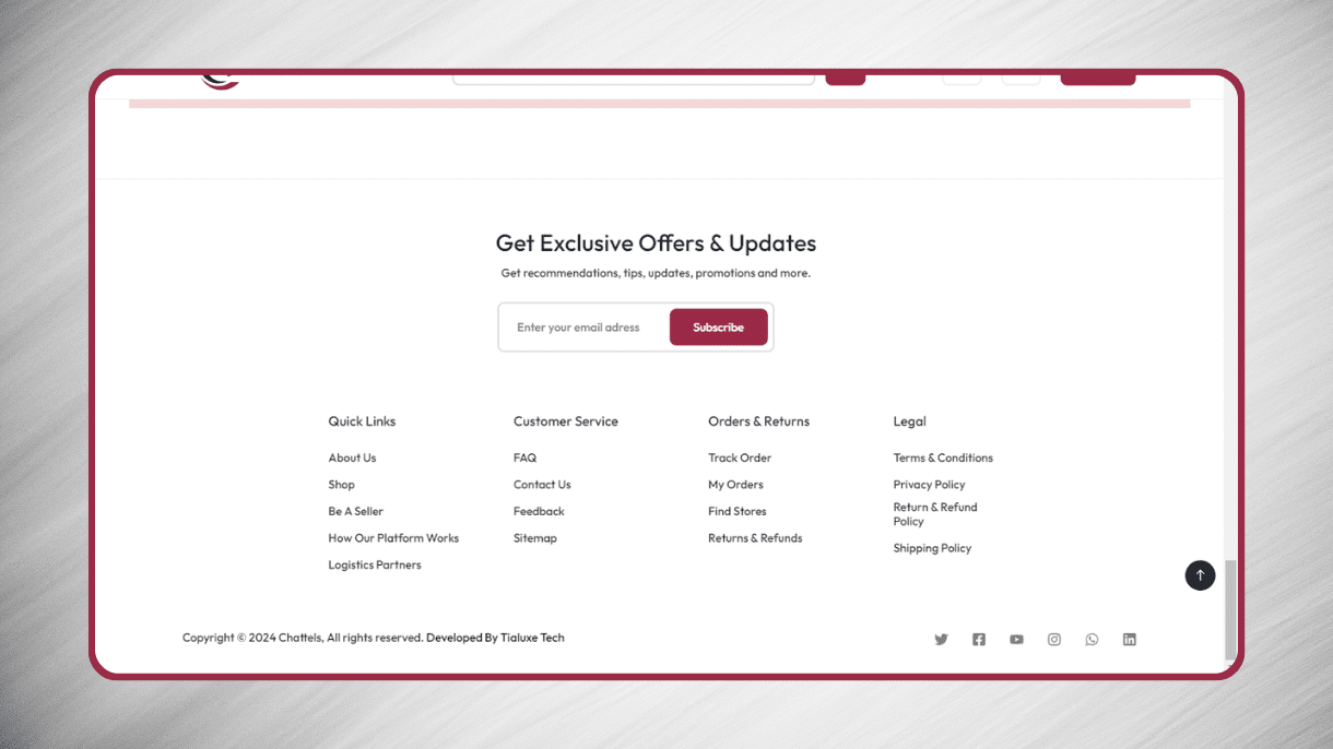
Developing the Chattels platform was one of my most challenging yet rewarding projects. The combination of custom features, advanced vendor tools, and a highly functional website created a seamless experience for all users, firmly establishing Chattels as a go-to marketplace in the furniture and appliance space.
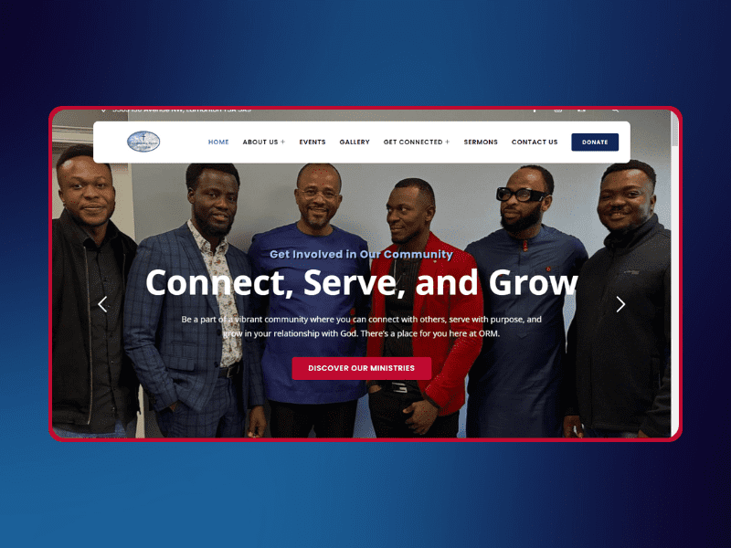
Developed a dynamic website for ORM Edmonton, a popular church in Edmonton, Canada.

ORM Edmonton is a well-known church located in the suburb of Edmonton, Canada. Michael, a representative of the church, contacted me to create a fitting website that would represent the church’s vision, mission, and community outreach. My task was to build a site that would not only serve as an online presence but also engage the congregation and attract new members.
I developed a comprehensive website for ORM Edmonton, using WordPress to ensure a user-friendly interface and easy management. The website highlights key features like upcoming events, sermon recordings, and an online giving platform, which enhances member engagement. I also integrated a blog for regular church updates and community stories.
The site is mobile-responsive, optimized for SEO, and designed to reflect the church’s identity. I worked closely with Michael to ensure that the content, images, and layout aligned with their message, while also providing functionality for new visitors to learn more and connect with the church.
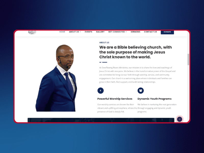


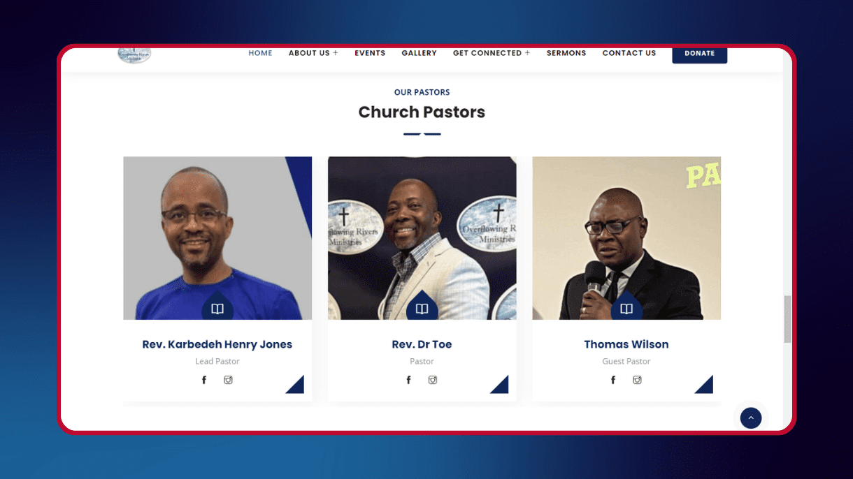
Building the ORM Edmonton website was an exciting project that resulted in a professional and accessible online platform for the church. The website continues to serve as a hub for church activities, enhancing communication and fostering a stronger connection with the congregation.
Developed a WordPress website for a charity supporting vulnerable individuals.

AdvanceGen is a charity focused on empowering children, youth, and homeless adults through education, mentorship, and community support. The organization fosters inclusivity and collective action, ensuring opportunities for vulnerable individuals. I was tasked with building a functional, user-friendly website that would effectively support their mission and enhance community engagement.
I designed and developed the AdvanceGen website using WordPress, ensuring it was tailored to the charity’s needs. The site includes essential features like a donation system, volunteer sign-up forms, and clear program information. To maintain accessibility, I ensured the website was mobile-responsive and user-friendly, allowing for seamless navigation and interaction.
In addition, I implemented a blog section to keep the community informed about updates and events, and optimized SEO to increase online visibility. By integrating these features, I was able to create an online platform that truly reflects the mission and vision of AdvanceGen, driving engagement and fostering support for their initiatives.

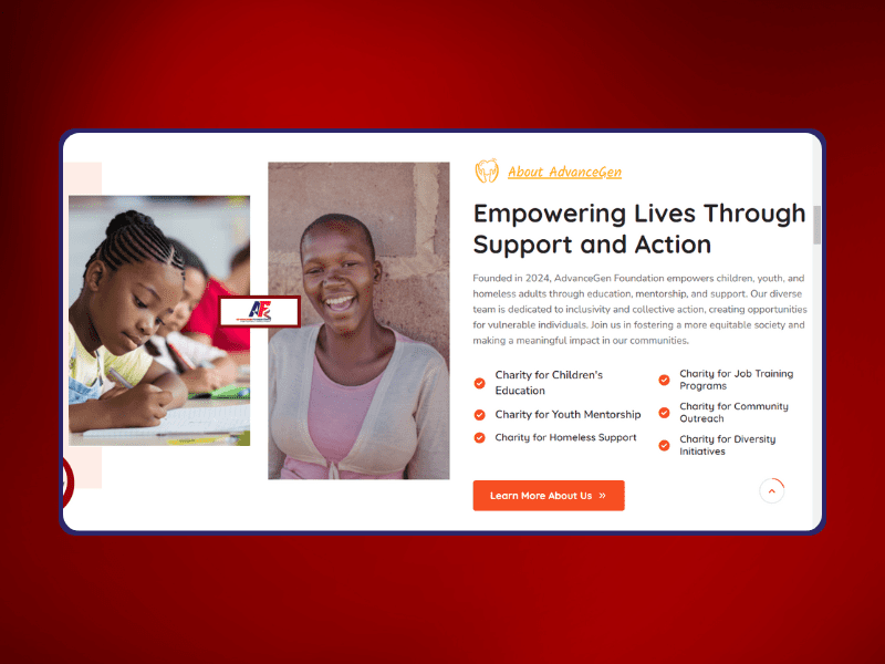


Through the development of the AdvanceGen website, I was able to create an effective platform that not only supports their mission but also engages donors and volunteers. The website continues to serve as a vital tool in their efforts to empower vulnerable individuals.
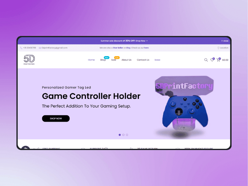
Discover how I partnered with 5D Print Factory to create a feature-rich Shopify store with advanced functionalities for seamless shopping.

5D Print Factory, owned by Daniel, is a thriving e-commerce business known for its success on Etsy. Daniel wanted to expand his business with a dedicated Shopify store, and I was tasked with building a feature-rich platform that complements his Etsy success. My goal was to create a fully functional e-commerce website tailored to his business needs.
Using Shopify, I developed a customized store that went beyond the platform’s default capabilities by utilizing the Shopify Liquid language. This allowed me to create a unique and fully tailored experience, adding advanced functionalities that enhanced both the front-end user experience and back-end store management.
I implemented product categorization, an intuitive navigation system, and integrated payment options for a seamless shopping experience. The site is optimized for performance and user interaction, ensuring that customers can easily browse and purchase products. These enhancements made the store more dynamic, helping 5D Print Factory stand out in a competitive market.
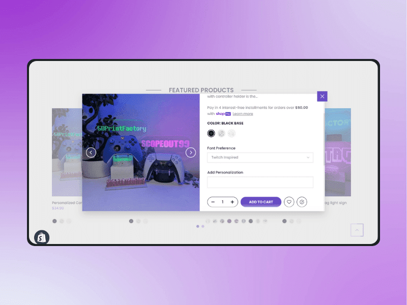

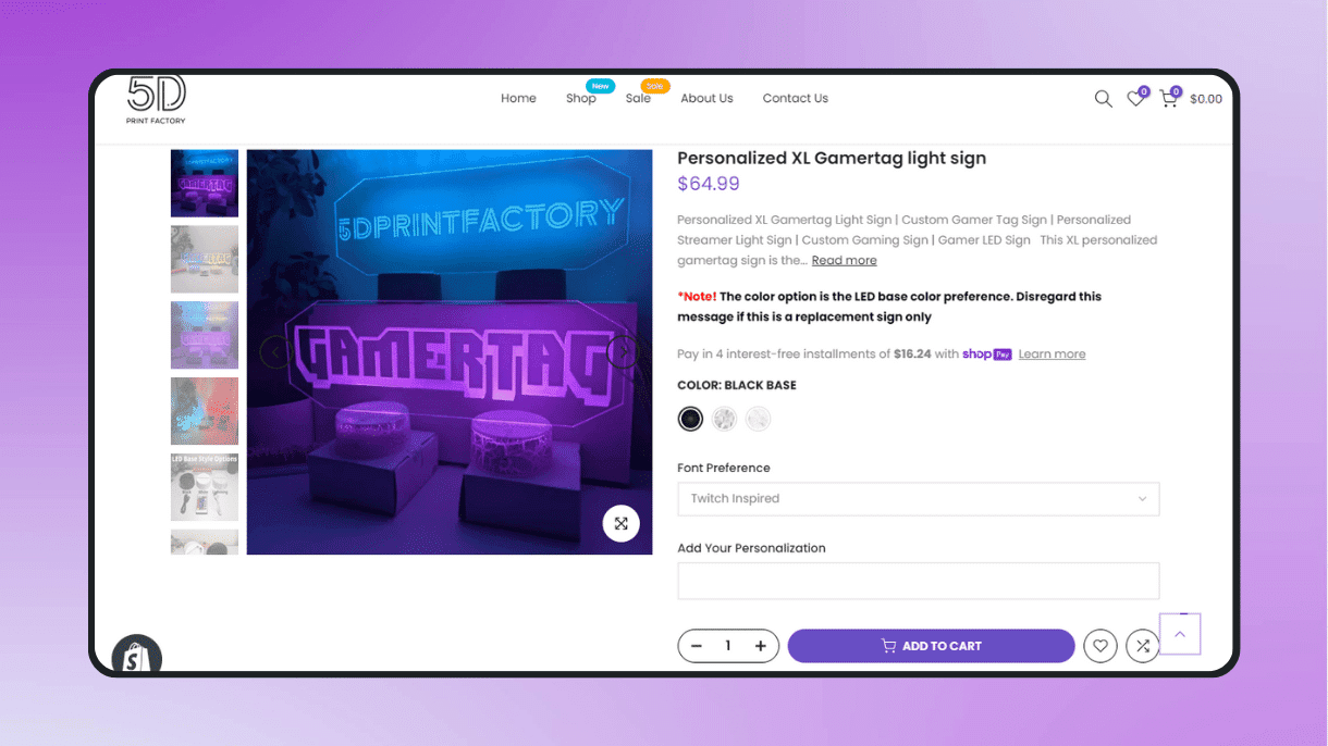
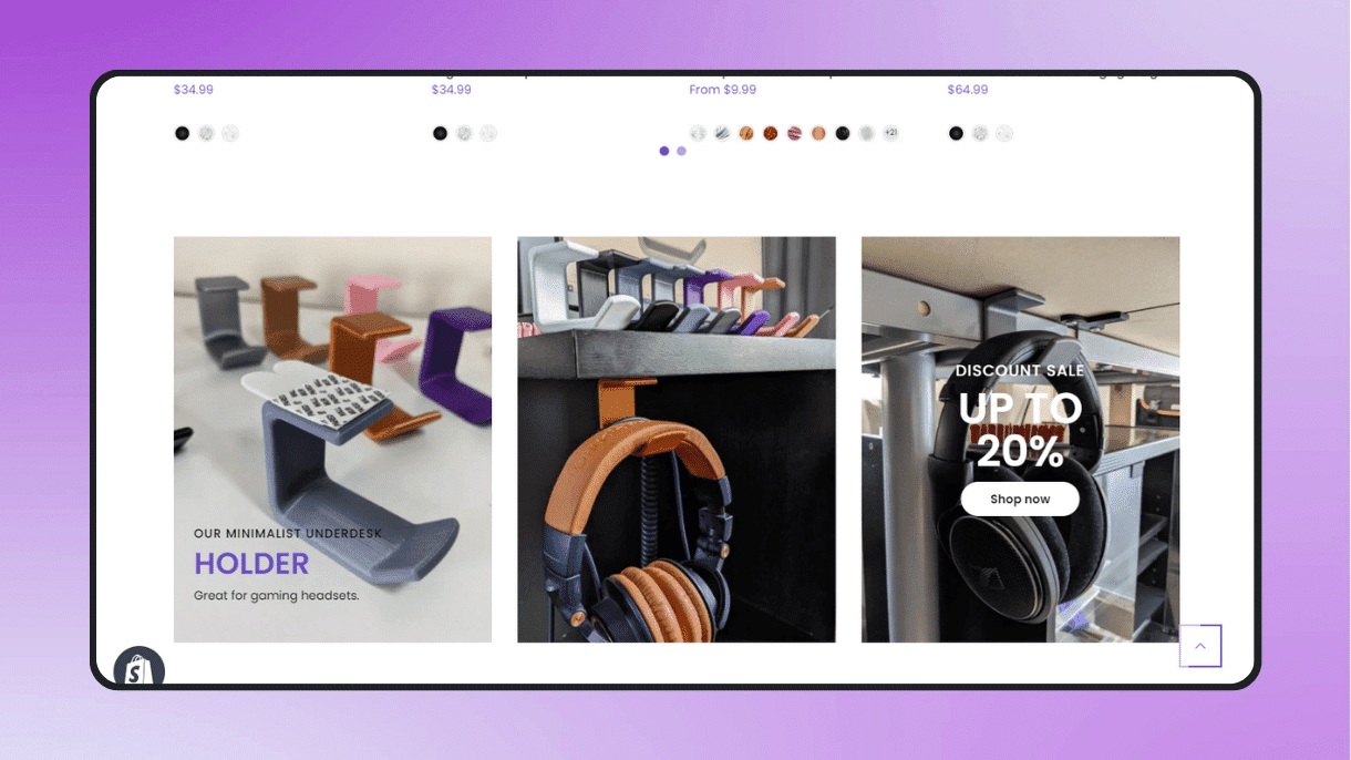
Building the Shopify store for 5D Print Factory was an enriching experience. The custom features and functionality I implemented not only met Daniel’s needs but also helped him scale his business beyond Etsy. The store continues to thrive, driving additional sales and growth for his brand.
Developed a gated membership-only forex signal website with push notifications.

Ago Market Fx is a forex signal platform that provides exclusive, real-time trading signals to its members. The website needed to offer secure access to signals for paid subscribers while ensuring that users received notifications as soon as new signals were posted. I was tasked with implementing these advanced features to enhance the user experience and ensure efficient signal delivery.
I developed the Ago Market Fx website using Advanced Custom Post Types (CPTs) and custom fields to handle the structured posting of forex signals. This allowed for precise management and presentation of trading data. I also incorporated a membership system that restricts access to signals only for subscribers, ensuring a gated and secure experience for premium users.
Additionally, I integrated OneSignal, enabling direct push notifications for immediate alerts whenever a new signal is published. This ensures that members are instantly informed and can act on trading signals without delay.


Developing the Ago Market Fx website was a rewarding challenge. The combination of a gated membership system, advanced forex signal management, and real-time notifications has equipped users with the tools they need for successful trading, while also creating a seamless and secure online environment for members.
Book an appointment with me for a one-on-one meeting
Transfer 500 USDT to either of these wallet address below;
For TRC20 Network: TUARUdZ6L53wx1GpsXcpMzxHdVRPhGNnV5
For ERC20 Network: 0xcfecbc095cd9eec151e4acc7458f8191b6abbc61
After completing your payment, use the button below to confirm your payment.
Transfer 500 USD to this email: adetunjitiamiyu5@gmail.com or its equivalent in EUR or GBP.
After completing your payment, use the button below to confirm your payment.
Transfer 500 USD or its equivalent to any of these bank accounts below;
USD (Domestic Wire and ACH Supported) –>
Account Holder: Adetunji Tiamiyu
Bank Name: Wells Fargo Bank, N.a.
Account Number: 40630181286751839
Routing Number: 121000248
GBP (IBAN) –>
Account Holder: Adetunji Tiamiyu
Bank Name: Clear Junction Limited
Account Number: 39359620
Sort Code: 041307
IBAN: GB31CLJU04130739359620
EUR –>
Account Holder: Adetunji Tiamiyu
Bank Name: Clear Junction Limited
IBAN: GB31CLJU04130739359620
Bic Code: GB31CLJU
Sort Code: 041307
After completing your payment, use the button below to confirm your payment
Transfer the equivalent of 500 USD in Naira to any of these bank accounts below;
Account Holder: Adetunji Tiamiyu
Bank Name: Kuda Bank
Account Number: 2052057054
Account Holder: Adetunji Tiamiyu
Bank Name: Palmpay/Opay Bank
Account Number: 8155356235
Account Holder: Adetunji Tiamiyu
Bank Name: First Bank
Account Number: 3146176761
After completing your payment, use the button below to confirm your payment
Transfer 300 USDT to either of these wallet address below;
For TRC20 Network: TUARUdZ6L53wx1GpsXcpMzxHdVRPhGNnV5
For ERC20 Network: 0xcfecbc095cd9eec151e4acc7458f8191b6abbc61
After completing your payment, use the button below to confirm your payment.
Transfer 300 USD to this email: adetunjitiamiyu5@gmail.com or its equivalent in EUR or GBP.
After completing your payment, use the button below to confirm your payment.
Transfer 300 USD or its equivalent to any of these bank accounts below;
USD (Domestic Wire and ACH Supported) –>
Account Holder: Adetunji Tiamiyu
Bank Name: Wells Fargo Bank, N.a.
Account Number: 40630181286751839
Routing Number: 121000248
GBP (IBAN) –>
Account Holder: Adetunji Tiamiyu
Bank Name: Clear Junction Limited
Account Number: 39359620
Sort Code: 041307
IBAN: GB31CLJU04130739359620
EUR –>
Account Holder: Adetunji Tiamiyu
Bank Name: Clear Junction Limited
IBAN: GB31CLJU04130739359620
Bic Code: GB31CLJU
Sort Code: 041307
After completing your payment, use the button below to confirm your payment
Transfer the equivalent of 300 USD in Naira to any of these bank accounts below;
Account Holder: Adetunji Tiamiyu
Bank Name: Kuda Bank
Account Number: 2052057054
Account Holder: Adetunji Tiamiyu
Bank Name: Palmpay/Opay Bank
Account Number: 8155356235
Account Holder: Adetunji Tiamiyu
Bank Name: First Bank
Account Number: 3146176761
After completing your payment, use the button below to confirm your payment
Transfer 150 USDT to either of these wallet address below;
For TRC20 Network: TUARUdZ6L53wx1GpsXcpMzxHdVRPhGNnV5
For ERC20 Network: 0xcfecbc095cd9eec151e4acc7458f8191b6abbc61
After completing your payment, use the button below to confirm your payment.
Transfer 150 USD to this email: adetunjitiamiyu5@gmail.com or its equivalent in EUR or GBP.
After completing your payment, use the button below to confirm your payment.
Transfer 150 USD or its equivalent to any of these bank accounts below;
USD (Domestic Wire and ACH Supported) –>
Account Holder: Adetunji Tiamiyu
Bank Name: Wells Fargo Bank, N.a.
Account Number: 40630181286751839
Routing Number: 121000248
GBP (IBAN) –>
Account Holder: Adetunji Tiamiyu
Bank Name: Clear Junction Limited
Account Number: 39359620
Sort Code: 041307
IBAN: GB31CLJU04130739359620
EUR –>
Account Holder: Adetunji Tiamiyu
Bank Name: Clear Junction Limited
IBAN: GB31CLJU04130739359620
Bic Code: GB31CLJU
Sort Code: 041307
After completing your payment, use the button below to confirm your payment
Transfer the equivalent of 150 USD in Naira to any of these bank accounts below;
Account Holder: Adetunji Tiamiyu
Bank Name: Kuda Bank
Account Number: 2052057054
Account Holder: Adetunji Tiamiyu
Bank Name: Palmpay/Opay Bank
Account Number: 8155356235
Account Holder: Adetunji Tiamiyu
Bank Name: First Bank
Account Number: 3146176761
After completing your payment, use the button below to confirm your payment
